Beginner's Guide to Color
I have no idea how I started with warm and cool colors, and ended up with Rumi, Nietzsche and Van Gogh...
painters

Admiring The Sower by Vincent van Gogh, 1888 | The painting is on display in Van Gogh Museum in Amsterdam
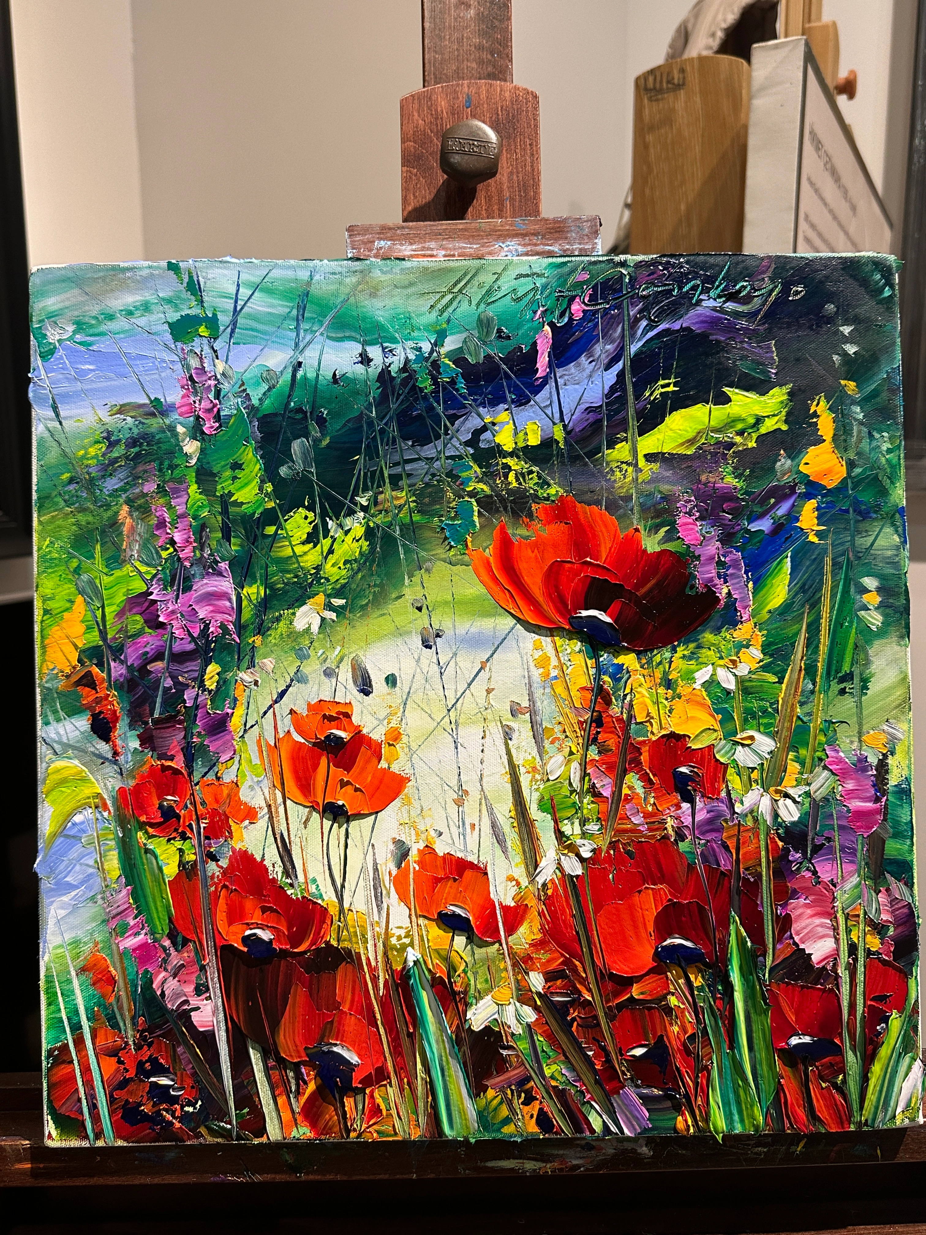
My favorite part of learning to paint has been discovering the world of color. I still struggle to capture nature on canvas, but that struggle has made me appreciate it even more. I’ve always loved sunsets and flowers, but now I feel them more deeply. It’s as if I upgraded my vision from 180p to 4K. Everything feels richer, sharper, more alive. When I started to pay attention to color of everything, I started seeing beauty everywhere. Even the mundane things became awe-inspiring. Which I believe is a superpower.
With just a little bit of knowledge of colors, you can not only up your painting game, but every aspect of your life. I’ve also begun combining colors with more confidence. Not just when I'm painting, but interior design, my outfits, and even the way I plate food. Color becomes a language you start speaking instinctively.
I hope in this post I'll tell you a little bit about colors without intimidating or overwhelming. Enjoy!
Understanding Color Better: A little bit of color theory
We often think of red, orange, and yellow as “warm” colors and blue and green as “cool” colors.
But within each family, there’s a spectrum.
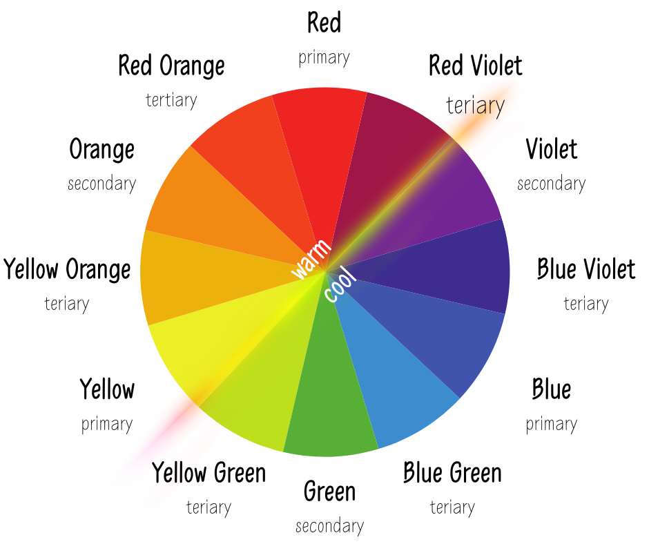
- Red can lean warm (toward orange) or cool (toward blue).
- Blue can lean warm (toward green) or cool (toward violet).
- Yellow can be warm (golden, leaning toward orange) or cool (pale, leaning toward green).
- Green can skew warm (yellow-green) or cool (blue-green).
- Purple can feel warm (red-violet) or cool (blue-violet).


With basic knowledge of colors you can set the mood, create depth, balance a palette, avoid muddy mixes, and guide the viewer’s eye through temperature contrast.
Objects are cooler in distance, and become warmer as it gets closer.
Warm colors (reds, oranges, yellows) tend to feel energetic, inviting, and bold.
Cool colors (blues, greens, purples) feel calm, quiet, or atmospheric.
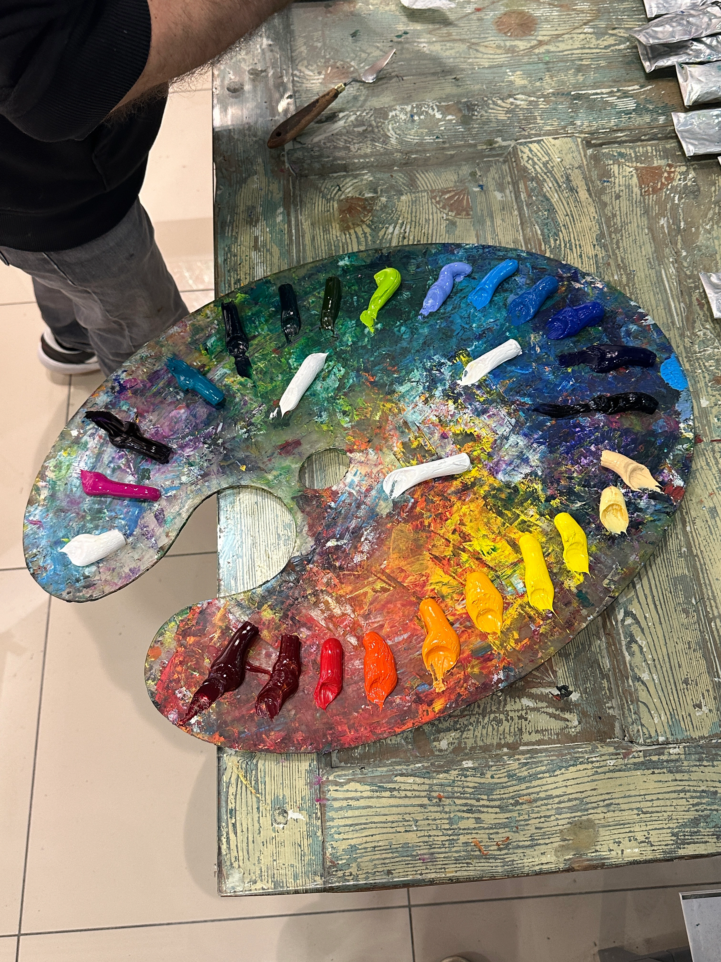
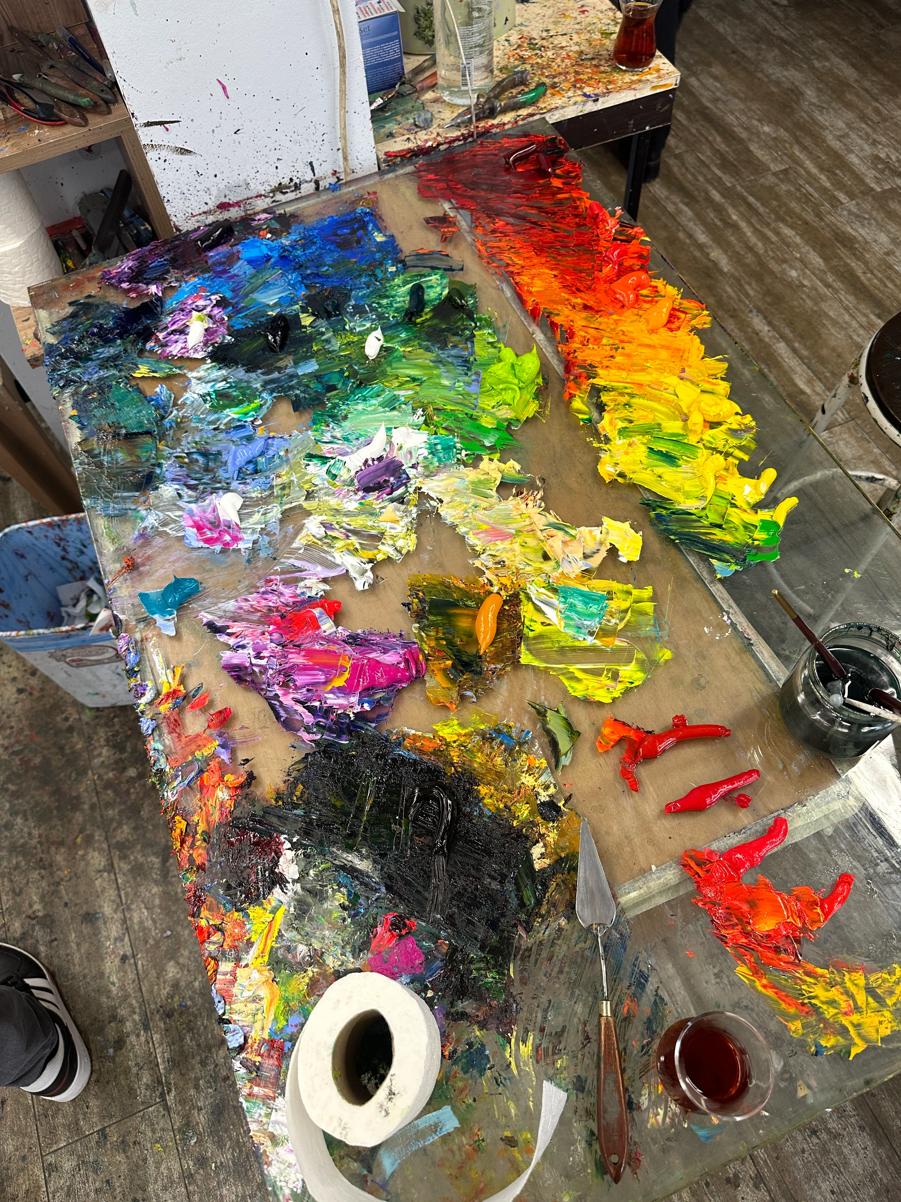
Clean colors on the palette means clean colors on the canvas.
My instructor Hikmet Çetinkaya's inspiring palette, and colors.
So next time you see an “ugly” fly, pay attention to its wings. I bet they aren’t just black. Look closely, and you’ll catch flashes of green, maybe even iridescent blue as it moves. Catching the light in ways you’d miss at a glance. And when you watch the sunset, really watch it. You might catch a sliver of sky that turns green. Yup, green. It’s shocking how often we look without truly seeing.
I's almost too easy to see the beauty in a flower. One has to have a different kind of soul to see the beauty in a fly.
“There is one thing one has to have: either a soul that is cheerful by nature, or a soul made cheerful by work, love, art, and knowledge.“ — Frederich Nietzsche
It's 2 a.m. and ofcourse seeing the beauty in "ugly" things brings me straight to Van Gogh.
"The point is that I’ve tried to bring out the idea that these people eating potatoes by the light of their lamp have dug the earth with the self-same hands they are now putting into the dish, and it thus suggests manual labour and — a meal honestly earned. I wanted to convey a picture of a way of life quite different from ours, from that of civilized people.” (Letter to Theo, April 1882)
That’s what moves me: he saw dignity where others saw dirt. He found humanity in the worn, the overlooked, the unlovely. He painted not beauty as we expect it, but beauty as it exists.
Rumi said,
“Ne kadar bilirsen bil; söylediklerin, karşındakinin anladığı kadardır.”
No matter how much you know, what you say is only as much as the listener can understand.
Things can be beautiful, full of color but if someone can’t see it, it remains invisible to them. This may seem exaggerated to you — but I won’t take it back. :)


